If you’ve ever used the search in data.govt.nz, you’ll find it currently only returns available datasets as the result. Things are changing though. We’re partnering up with the Stats NZ Data Leadership Hub to add more content around standards, guidance, and case studies so there is a growing need to improve on the findability of content other than datasets.
This means we have an interesting problem to solve.
How do we make search easy to use regardless of whether you're looking for datasets, website content, or both?
We thought this was a perfect time to involve you, the users of data.govt.nz in the process.
Our user experience team looked into the assumptions being made about how search is used, brainstormed a number of approaches to test, and explored existing design patterns. We also had to balance factors relating to users ability to accomplish their search goals, the development effort to change our search, and cost of implementation.
Ideally we wanted to create a familiar experience of search that users don’t have to think too much about to find what they set out to.
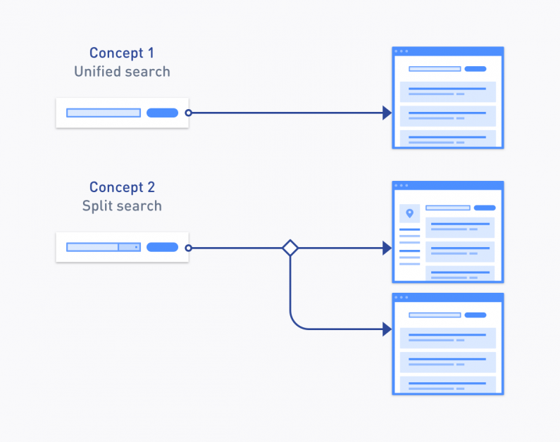
In the end, we settled for two concepts that we wanted to validate with data.govt.nz users.
We’ll refer to these as “Unified search” and “Split search”.
We retain the current search box, however the search results page includes a mix of website content and datasets. Results can be filtered by the type of content for example: datasets, blog posts, standards etc.
Although we liked the simplicity of having one search field, we also acknowledged that some of our users, predominantly power users, would eventually want to dig deeper and filter datasets on a more granular level. This concept would also be the more expensive option to develop, since datasets would have to be indexed in our Common Web Platform (CWP) search engine (they are currently part of our CKAN data portal only). This requires some integration between CWP and CKAN not to mention numerous API calls needed to be made to populate the search results.

Search results page with a mix of content and datasets
A dropdown was added to the search field to allow for switching between datasets and website content (similar to TradeMe and Amazon). Depending on the choice, the user would be redirected to either the dataset results page or a content only results page.

Search field with dropdown to switch between datasets and content
Separating datasets from content means that we can retain the current dataset results page with its advanced filters. Those searching for content wouldn’t have datasets cluttering their results, while still being able to filter based on content types.
We wanted to test our assumption of the need to return results from both datasets and content, alignment of the dropdown box (left or right) and whether users would even notice it.

Search results page with top level content type filter
Now that we had settled on two concepts to test, it was time to validate these with our data.govt.nz users. The concepts were turned into clickable digital prototypes without needing to go to the expense of writing any code.
Usability testing doesn’t need to take a long time to do and some testing is always better than no testing. With this in mind, we made use of Twitter and a number of other open data community channels to recruit our helpers and ran the testing sessions in less than a week. We’ll of course look to have more opportunities, more regularly for feedback into data.govt.nz.
Here are some of the observations from the usability session:
Both concepts performed equally well with minor nuances
Most participants, due to the familiarity with the site, decided to browse to the correct section via the site navigation
Most participants weren’t too vocal about the mix of dataset and website content results, however many would like to narrow down search results to an ever granular level – almost replicating the style of filters on the current dataset results page,that is, having “advanced” search after an initial keyword search.
Some participants didn’t notice the dropdown when right-aligned, while others concluded that it was the more logical place since it followed a pattern of ‘search for x in place y’
“I’m more of a searcher than a browser – very seldom come in through homepages (always google)”
“Would expect it [standards on how to clean data] to come with each dataset because each [dataset] would use different standards etc. Especially for APIs”
“That's really cool [the dropdown]. That will be really helpful to people. Noticed the dropdown on the right but can imagine that people might not see it (right-hand blindness)”
On top level content type filters: “It took me a second to realise what it was doing and it just seems very specific”
While we got some valuable insight into what we might do for search it’s not conclusive as yet so feel free to add your comments below on the concepts above.
Do you prefer one over the other, if so why? Have you got a better idea? Let us know. We’re keen to hear about it.
If you would like to participate in upcoming testing sessions please...
Join the usability testing mailing list
